

Last month, we posted a guide to the 12 Principles of Graphic Design, which briefly discussed how to use contrast. Well, in this article, we’re taking a deeper dive into the first graphic design principle, which as you’ve already guessed, is Contrast.
What is Contrast in Design?
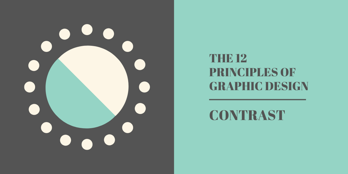
Contrast is the difference between multiple elements within a design, the difference that makes them each stand out from one another. Effective use of contrast can help you guide the viewer’s eye to the most important elements of a design.
Contrast isn’t limited to just sizing either. You can play with contrast in typography, colours, shape, and any other visual element within a design.
It can be argued that contrast is one of, if not the, most important principle of design, as it’s this that’ll influence how an entire composition is perceived and understood by the viewer. Because of that, it’s vital that you understand how to use the different types of contrast when creating content.
Colour Contrast
One of the most common ways to use contrast in your designs is by making use of juxtaposing colours that can be clearly differentiated from one another. This can be done by using different shades of the same colour, playing with hues, adjusting temperature, and more.
Colour: Dark and Light
This is likely going to be the most common way that you make use of contrast in your design work. Have you ever seen an image online that contains text, but the text and the background colours are too similar, making it unreadable? That happens when the designer doesn’t correctly use contrast.
Similarly, putting light text on a light background has the potential to make that text equally unreadable, and the same can be said for using dark text and dark backgrounds too.
One way to avoid this is by using a mix of dark and light colours within your design. The typical approach is to use a light background and dark text, like the article you’re reading now. You don’t have to always stick to that, but a good rule of thumb is to avoid displaying large chunks of text on dark backgrounds. That has a tendency to strain the reader’s eyes, and can cause them to close, delete, or otherwise look away from your design.
Colour: Hue
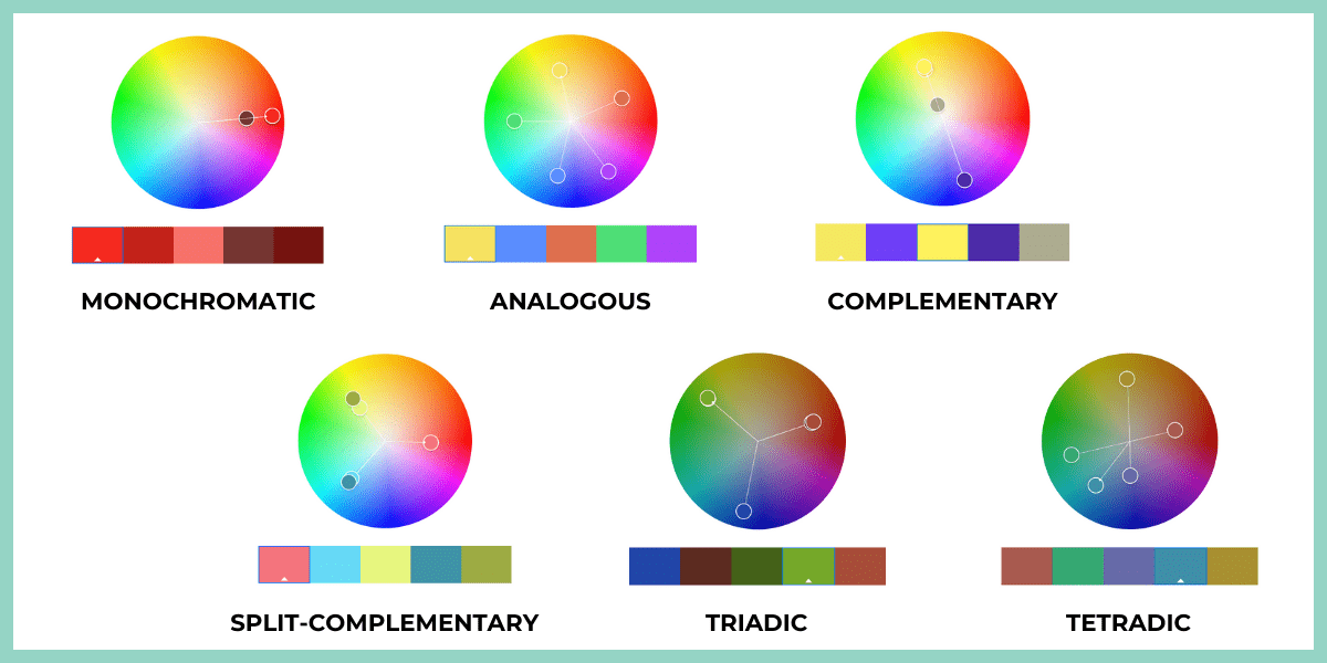
“Hue” is really just a term for a specific colour – most commonly one of the twelve that appear on the colour wheel. Whilst the colour wheel has been a go-to tool for artists for centuries, graphic designers and content creators alike can use it to create stunning, high-contrast colour schemes too.
But it doesn’t just stop with one type of contrast! Using the colour wheel, you can create a whole bunch of different schemes that all contain individual colours that work well with one another. Some methods include:
Complimentary – The opposites on the colour wheel. This can be things like red and green, blue and orange, etc. Complimentary colours, when pulled from the wheel, will always be high-contrast.
Triadic – This is any three colours that are evenly spaced on the wheel. These will typically be very different colours, however they usually work very well with one another.
Monochromatic – Using this method will give you a range of colours from the same hue. In our example below, we’ve used the monochromatic method to grab a nice range of red.
Colour: Temperature
Every single colour can be split into one of three categories, which are warm, cool, and neutral. Warm colours are reds, oranges, and yellows, with blues and greens being cool. And then black, white, and grey are considered neutral. Depending on how they’re used, colours like beige and brown can also fall into neutral.
The classification of colours into warm, cool, and neutral is something that we humans intuitively understand. But what not a lot of us know is that by mixing warm and cool colours, we can create dramatic contrast within our designs.
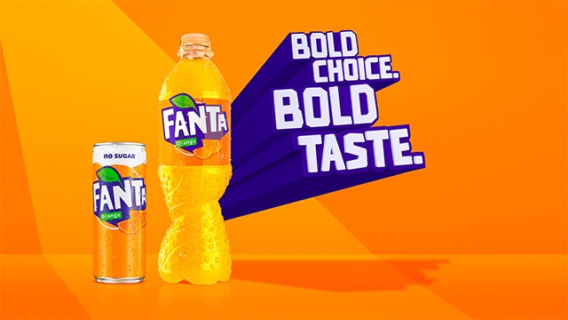
The Fanta graphic below is a great example of using temperature to create contrast in a design. The warm orange juxtaposes with the cool blue. Because these both contrast so strongly, the colour scheme helps to reinforce the Bold Choice, Bold Taste message of the ad.
Design with Shape Contrast
Now that you’re an expert in designing with colour contrast, let’s look at shape. Shape obviously plays a huge role in design, and, in-part, determines the style of elements on a page. There are two primary ways in which you can use shape to create contrast, which are using a mix of organic and geometric, and playing with sharp and rounded edges.
Shape: Organic vs. Geometric
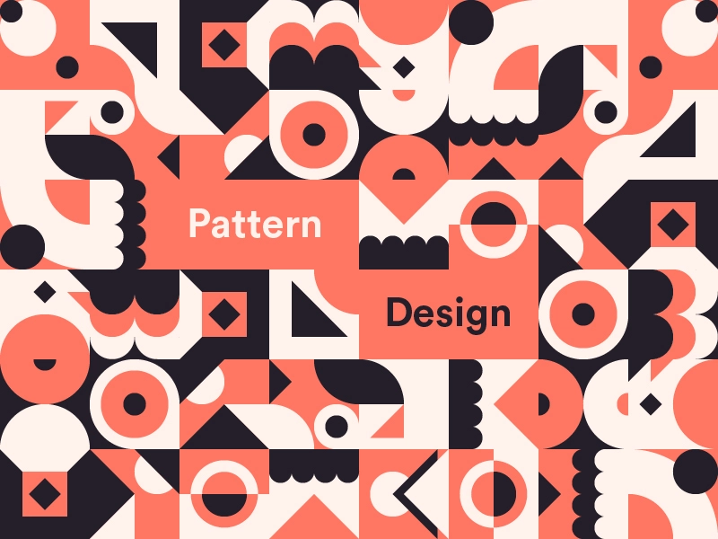
By and large, most shapes will fall into one of two categories, which are organic and geometric. Organic can be defined by curved, nature-inspired elements that tend to stray from straight edges. Whereas geometric includes simple shapes like rectangles, triangles, circles, etc.
Mixing these shapes (where your branding allows) can create a nice contrast between the multiple elements within a design, like in the example below. Whilst this isn’t from a marketing campaign, it does help to illustrate the contrast between organic and geometric.
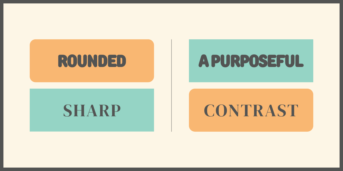
Shape: Sharp vs. Rounded Edges
A subtle way of creating contrast in your designs is by using a mix of sharp and rounded edges on the various elements. This can be achieved by wrapping a serif font in a rounded box, for example.
Rounded edges tend to have a more relaxed, friendly appearance, whereas sharper shapes make the design feel more formal and organised. These qualities work very well when contrasted against each other.
Now that you know how to use contrast in your designs, you’re well on the way to creating successful, eye-catching graphics and content! Ready to grab some more tips? We’ve got everything you need in our 10 Design Tips to Take Your Social Media to the Moon Infographic!