
As social media managers, understanding the basic principles of graphic design is essential. Knowing how to put together visually appealing graphics will ensure your ads and social content are eye-catching, engaging, and successful.
But, without going to design school, there’s no way you can get a good grasp of the 12 principles of graphic design, right? Well, no!
In this article, we’ll be covering the basics of graphic design. You’ll learn about the 12 principles of graphic design, and see how they work too. Keep scrolling to start learning!
The 12 Principles of Graphic Design
Contrast
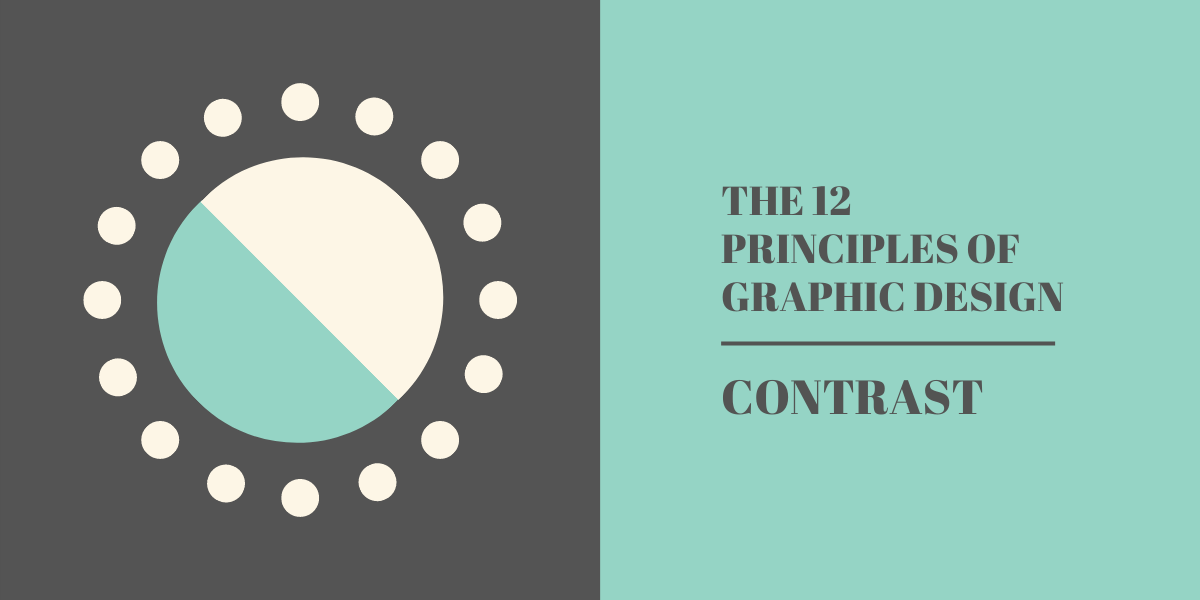
Contrast is the difference between multiple elements within a design, the difference that makes them each stand out from one another. Effective use of contrast can help you guide the viewer’s eye to the most important elements of a design.
Contrast isn’t limited to just sizing either. You can play with contrast in typography, colours, shape, and any other visual element within a design.
When playing with contrast, make sure you understand the basics of colour psychology!
Balance
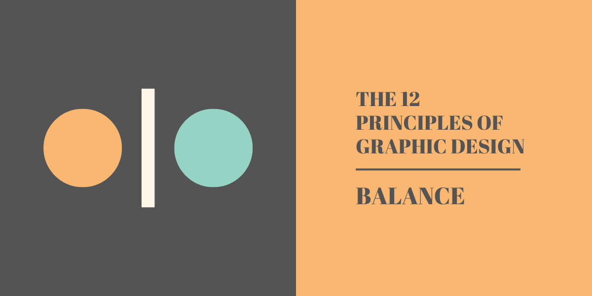
Balance is one of the most important aspects of layout. A correct use of balance in graphic design will ensure the elements are weighted correctly, creating an aesthetically pleasing graphic.
There are four primary frameworks you can use to balance your designs. These include symmetrical balance, asymmetrical balance, mosaic balance, and discordant balance. Here’s a great guide to using balance in your designs.
Emphasis
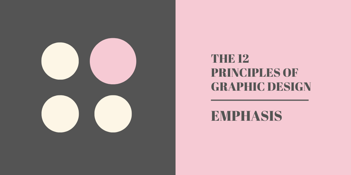
You know when you pick up a newspaper (if you’ve somehow time-travelled to the 90s), you’ll notice the big, bold headline first? That’s because they’ve drawn your eye to it by using emphasis.
Using emphasis allows us to control where the viewer’s eye is drawn to, helping elements to stand out when compared to others on the same page.
You can play with emphasis by tweaking aspects of your design, including proportion (see below), colour, contrast, shape, and more.
Proportion
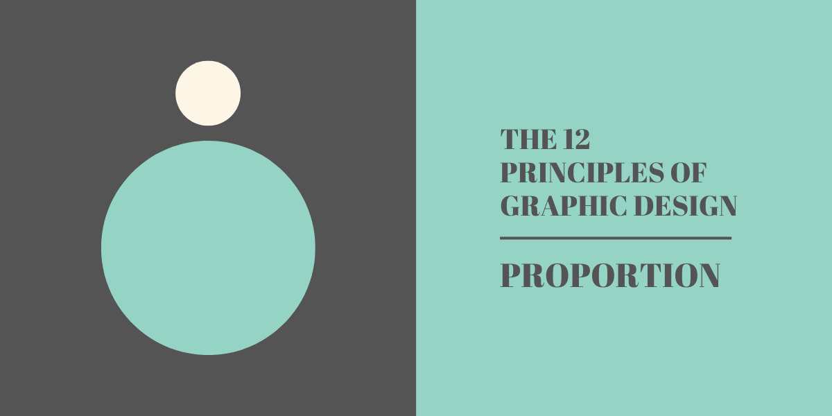
Designers love big words that make things sound more complicated than they are… Proportion is just size, specifically the size in comparison between two or more elements within a design.
When using proportion, it’s important to remember that larger elements are usually seen to have more importance than other, smaller elements. Think back to our newspaper headline example above.
Hierarchy
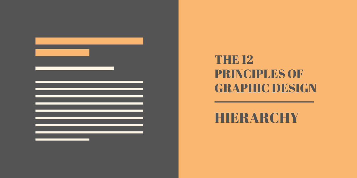
Taking our newspaper, if we were to open it up to read an article, we’d see a clear hierarchy between the elements. The headline will be the largest, and then the body text, right down to image captions. Each of these elements will be sized and positioned to reflect their levels of importance.
Hierarchy in design refers to the implied importance of elements within a design. The most important elements should be the most prominent, with descending levels of importance of other elements being matched in the design.
Rhythm
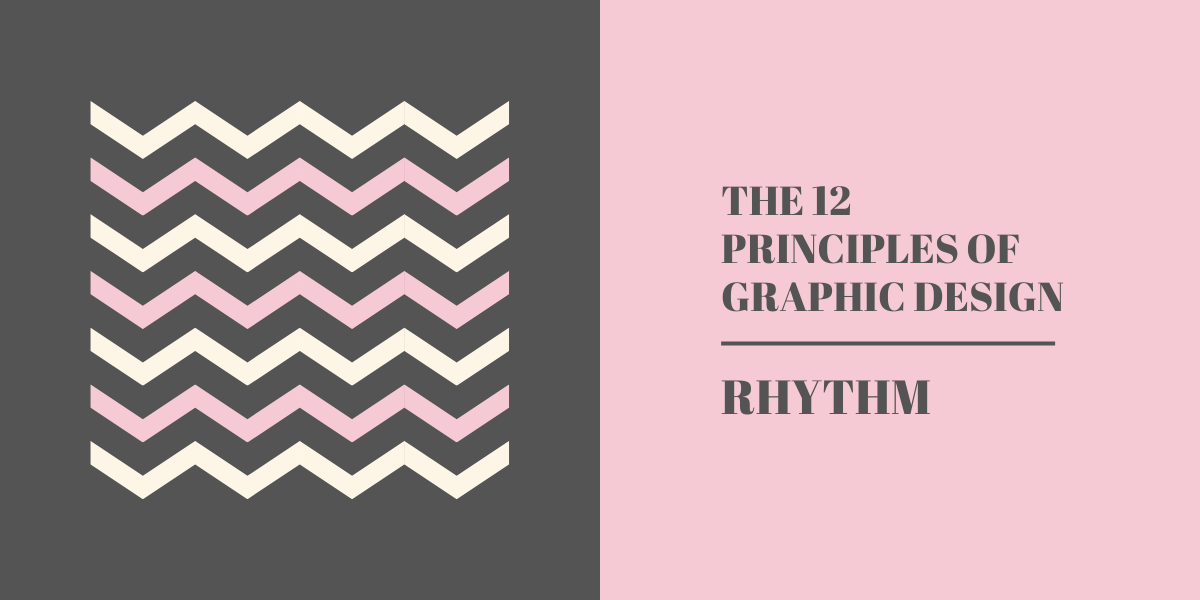
Rhythm isn’t just for music! As a graphic design principle, rhythm refers to the relationship between elements to create a sense of harmony. These can be seen very clearly in patterns, but aren’t limited to just that.
You can apply rhythm to entire compositions within your design. Use a regular rhythm to create a sense of calmness in your design, or use an irregular rhythm to generate excitement.
Repetition
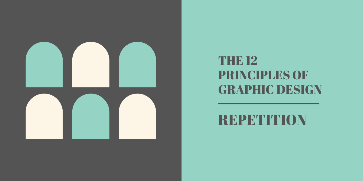
Repeating elements within your design (or across multiple designs) will reinforce an idea or perception. When working on designs, you should look to have uniform styles for commonly appearing elements, such as headers, images, fonts, etc.
Repetition is most prominent when we think about branding. If you see an ad from McDonald’s, you’ll immediately know who it’s from, because of the uniform sounds, colours, logos, and imagery used across its branding.
Pattern
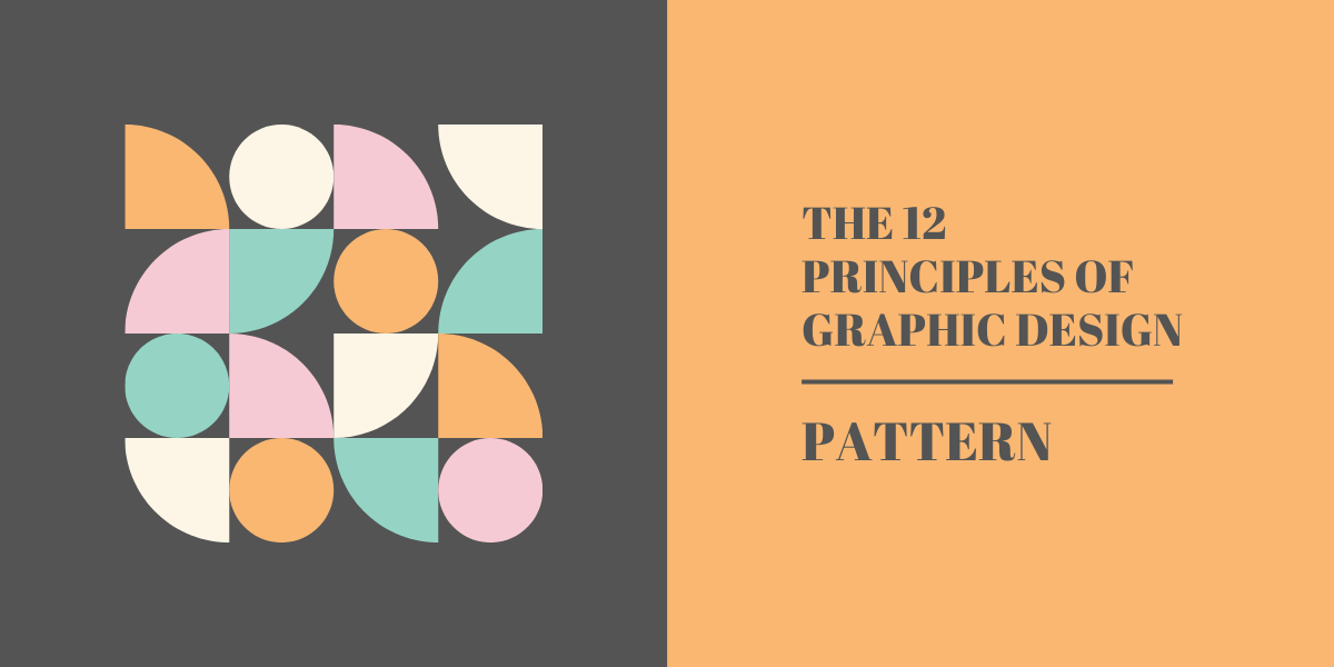
You already know what patterns are, cool images used as backgrounds, right? Well yes, but in design terms, pattern is also a repetition of elements to create a cohesive design.
Typically, pattern is used as a set of standards for commonly repeating elements. For example, look at our cool little graphics for each of the principles. They each have the diagram on the left, and the information on the right. That could be considered a repeating pattern within the article you’re reading right now.
White Space
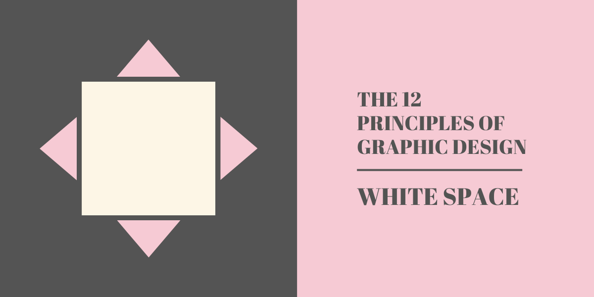
A lot of people who don’t know the principles of graphic design struggle here. White, or negative, space is the area of a design that, ironically, doesn’t have any design elements.
It’s important to make use of white space to create designs that are uncluttered and easy to understand. In the case of using white space correctly, less really is more.
Movement
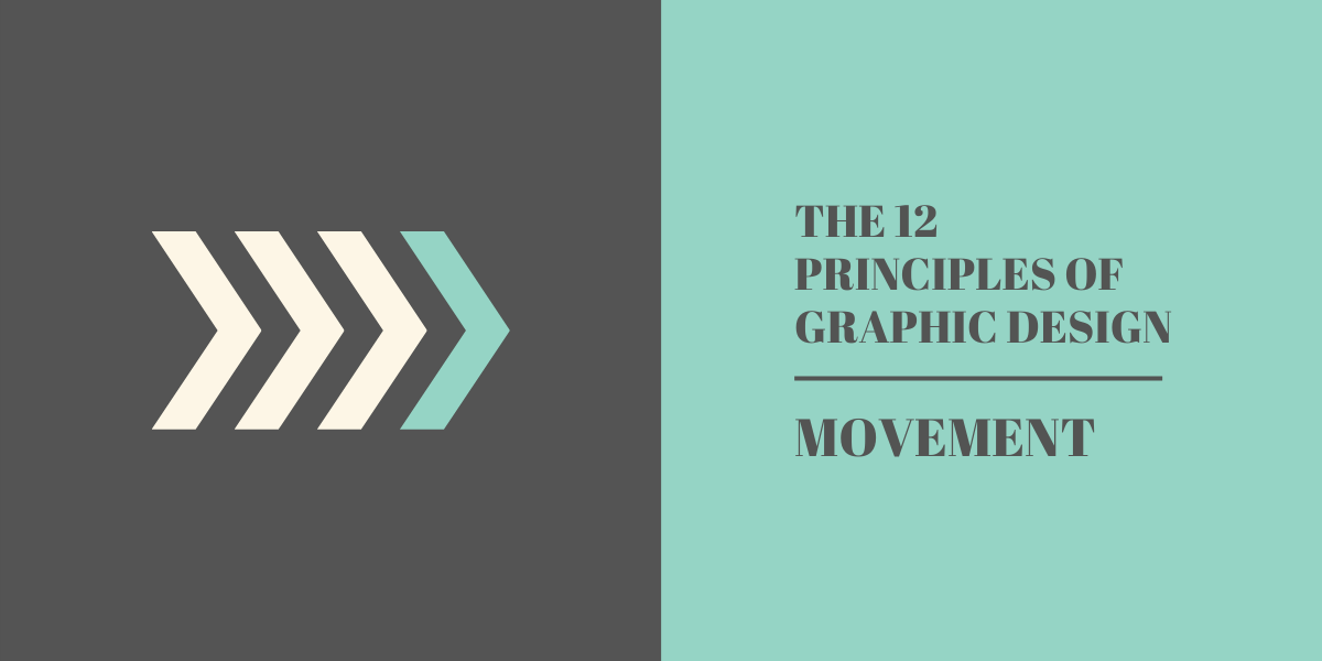
Our eyes aren’t static. When we look at a design, we don’t focus on one thing, instead, we move our eyes from element to element to get a full, complete picture of the overall design. It’s during this movement that we unconsciously determine which elements deserve more attention, and where we should look next.
Understanding where in your design the viewer will start looking, and where they’ll move next, is vital. By using positioning, emphasis, hierarchy, and other design principles, you can influence the order in which a person will move their eyes through your design.
Variety
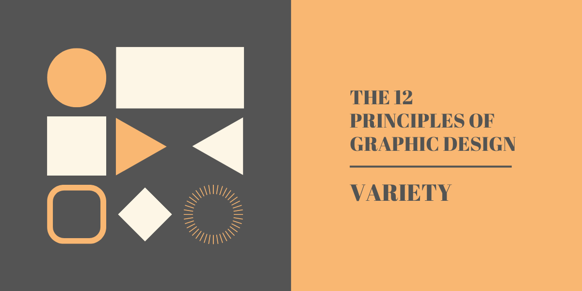
When you put too much focus on things like repetition and pattern, you run the risk of your designs becoming stale. This is where variety comes in.
Variety as a principle of graphic design teaches us the importance of using, well, a variety of elements within your designs and overall branding.
Variety can be created by using a range of typography, colours, shapes, images, textures, and more. The big thing to remember is to not include too many unique elements in one design. Doing that is a very quick way to make your work feel cluttered and disorganised.
Unity
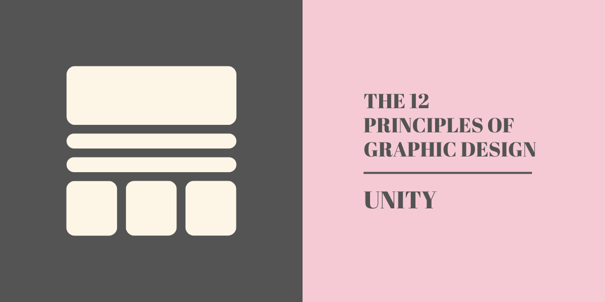
Whilst there should be variation in your elements, there should also be unity. There should be a clear relationship between each of the elements you’re using. Creating a relationship between elements can help to communicate a clear, cohesive message.
When coming up with branding elements, think about how each of the elements relate to the others. This can be large scale, like using the same effect on all images, or it can be tiny details like using rounded edges in your designs.
It’s the unification of seemingly tiny details that will build up to create a cohesive, recognisable brand.
Looking for more design tips and tricks? Our infographic has 10 design tips to send your social media to the moon!