
When we think about balance in design, we should be thinking about how the visual weight of elements are balanced to create cohesiveness and cohesion.
There are five different balance styles, which are Symmetrical, Asymmetrical, Radial, Mosaic, and Discordant, and as you read through our guide, you’ll learn how each works.
Why is Balance in Design Important?
Without a sense of balance, your designs can feel disorganised, with each element appearing out-of-sync with the others on the page. Additionally, your viewer may become confused and disinterested in your design.
Correctly using balance in design can allow you to create uniform and visually interesting designs that catch the eye and hold the attention of your viewers.
Balance in Design: A Note on Visual Weight
Visual weight can be influenced by several properties, including colour, size, shape, texture, and more.
For example, darker colours will be perceived as being heavier than their lighter counterparts, and larger elements will be considered heavier than smaller elements.
The key to mastering balance in design is having a solid understanding of what contributes to making certain elements feel heavier/lighter than others.
Symmetrical Balance
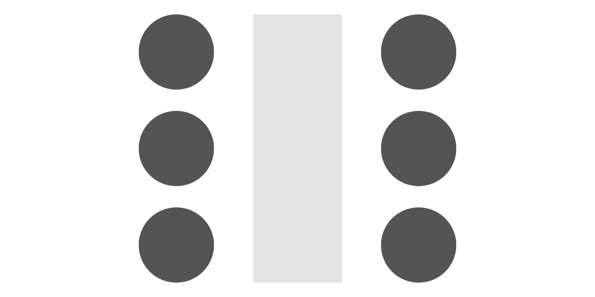
As you can already tell from the title, symmetrical balance involves evenly distributing visual weight across the design. This can be in any direction: vertical, horizontal, diagonal, etc. Basically, if you draw a straight line in any direction across your canvas and evenly space visual weight on both sides, you’ll have a final product that’s symmetrically balanced.
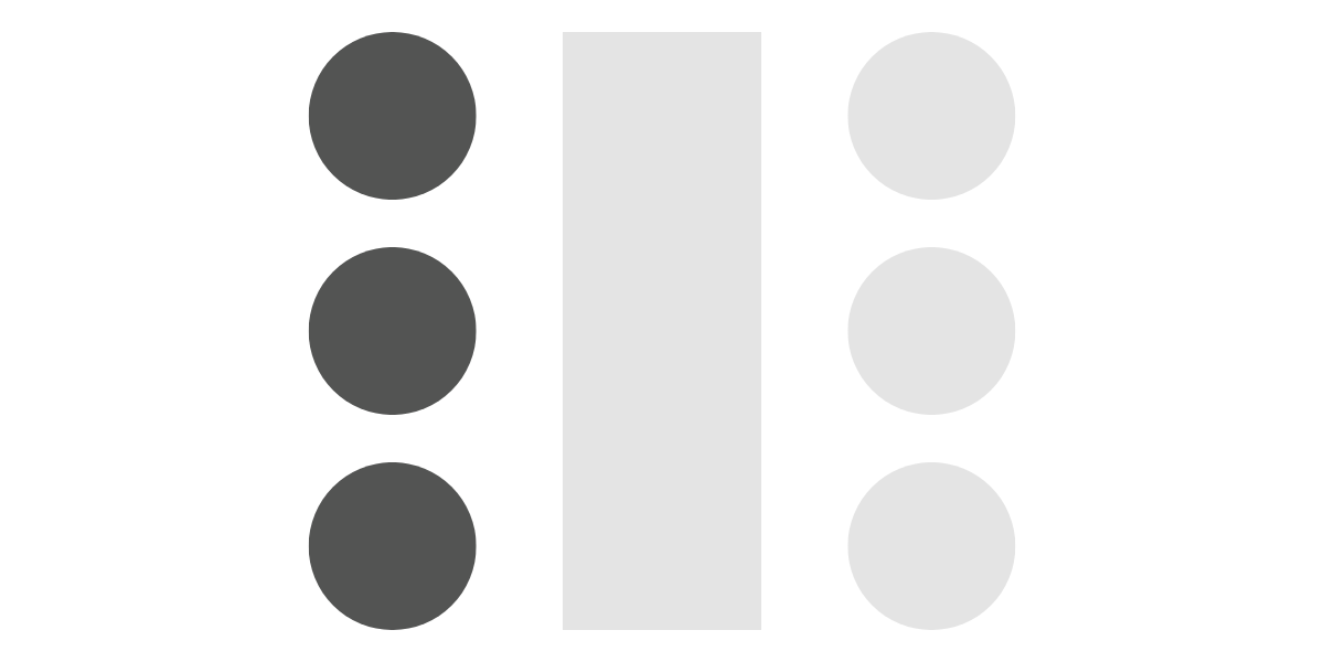
Below, you can see an example of a simple composition that is symmetrically balanced. Both sides have the same visual weight, so neither feels heavier than the other.
However, as you can see from the slight modification in the image below, changing the colour of the circles on the right makes the whole design feel unbalanced, with the weight being shifted to the left hand side.
This is why you need to pay careful attention to every element on the page when creating symmetrical designs. A seemingly unimportant tweak could throw the whole composition out of balance.
Asymmetrical Balance
Believe it or not, you don’t need to create an entirely symmetrical design for your composition to feel balanced. In fact, there are cases where asymmetrical balance is the best option.
In cases where you want to create a heightened sense of visual tension or intrigue, asymmetrical balance is a great option.
But, if a page isn’t symmetrical, how is it balanced? That’s a good question! Think back to when you were a kid playing on a seesaw with a friend. You were both constantly moving; however, both were balanced at all times. That’s how asymmetrical balance in design works.
Look at the example above. You can clearly see that it’s not a symmetrical composition, but the overall design feels balanced – why?
A big contributor to this is the colours. You can see two similar shades of blue on the left and right sides of the design, which helps to stabilise the composition. Additionally, the four outer boxes are framing the central, darker box, creating a focal point in the design. And finally, the darker colour of the central square feels heavier than the surrounding elements, balancing out the design.
Radial Balance
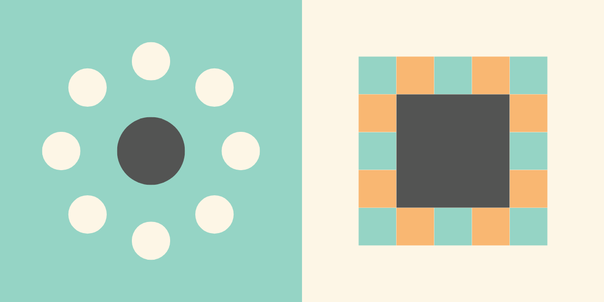
Radial balance is a fairly easy way to create a visually interesting design without sacrificing cohesion. This is typically done by positioning a large element in the very middle of the canvas and adding small elements at equal distances around the periphery.
Mosaic Balance
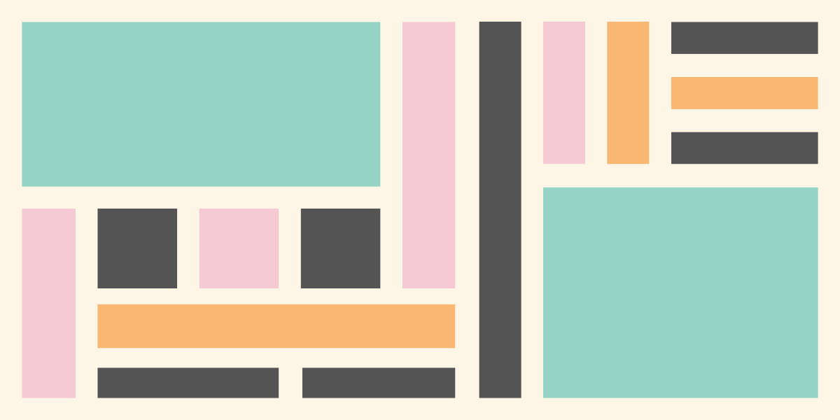
A good way to think about Mosaic Balance is “organised chaos.” At first glance, this form of balance may feel disjointed, chaotic, and unorganised, but when you look closer, you’ll see that careful decisions have been made with each placement.
You can also think about it like a Jackson Pollock painting. When you first glance at the canvas, the painting looks like a mess, but the more you look, the more you’ll see order and balance.
Discordant Balance in Design
Now that you know four ways to use balance in your work, it’s time to break all the rules. This form is balance is best thought of as anti-balance. The goal here is to purposely create a design that’s visually jarring and uncomfortable.
If you have the goal of getting a viewer to stop in their tracks, discordant balance could be a useful tool to use. Just remember, as we learned at the beginning of the guide, visually jarring designs can make the viewer lose interest in your work, so use this at your own risk!
/
Now that you know how to use balance in your work, it’s time to brush up on the other graphic design principles you have at your disposal. Luckily, we’ve got an overview of each one in our 12 Principles of Graphic Design infographic!