

Are you looking to learn how to use proportion in design to create better content? If so, you’re in the right place!
Maintaining proper proportion between the elements in your design is essential to ensuring that the composition has a harmonious feel to it. If you’re aiming to create social content that’s both cohesive and visually appealing, using the correct proportion between each of the elements should be a priority.
In this guide, you’ll learn exactly what proportion in design is, how it works, and how you can use it to level up your social content.
What Does Proportion in Design Mean?
In graphic design, proportion refers to the relative sizes of the elements within a composition. When it comes to the sizing of elements, there may be times where you don’t need to worry too much about the individual sizes of specific elements, however, you should always be thinking about element sizing in relation to the others on a page.
For example, when creating a social post, the title will naturally always be the largest element within the composition, and the actual content will be smaller. This is to help your readers immediately understand what the post is about, and then be able to know which information they should read next.
These hierarchical calculations happen in our brains subconsciously, however, it’s the content creator’s understanding of proportional scaling that aids the decision-making. Without correct proportions for each of the elements, your audience may become confused, not knowing where to direct their attention.
Keep reading to learn the simple, but essential, methods of using proportion in your social media content!
How to use Proportion in Design
Paying attention to the proportion of elements in relation to each other in your design can influence the way readers interact and interpret your content. By making use of the tips below, you can “control” how the viewer will read through your content.
Similar Elements Should be the Same Size
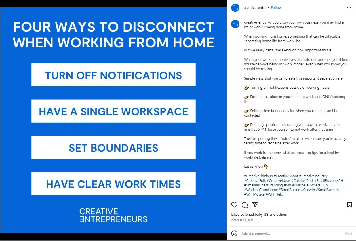
As you can see from the image above, the tips all have the same width, font size, and height. Additionally, all are uppercase.
Contrast that to the larger title, and the smaller Creative Entrepreneurs logo at the bottom, and you’ll see proportion in design at work.
Viewers of this image will read the title first, then naturally move on to the next-largest group of elements, the tips, and then finally to the logo.
Grouping similar elements and matching size is a very easy – and logical way – of adding proportion to your work, whilst also maintaining a distinction between all the elements within the composition.
Larger Elements Show Increased Importance
You could argue that in the example above, the most important element of the content is the group of tips in the centre.
However, when we think about importance in graphic design, the most important element is typically the title. This is because having a clear and distinct title in your content allows readers to immediately recognise the subject matter.
It’s the same in the article you’re reading right now. Notice how the title of this section is smaller than the “How to use Proportion in Design” title? By using proportional sizing, we’re able to clearly show groups of information within an article.
Design for the Platform
It’s important to remember that every social media platform is different, which means they each have their own quirks and requirements when it comes to content design.
For Instagram, you can stick to square (1:1) proportions and you’ll be fine, whereas platforms like Twitter require more rectangular images.
Before creating content, think about the platforms you’ll be posting to, and what the requirements will be. This great guide from Hootsuite is very helpful for checking the correct proportions for each social media platform.
/
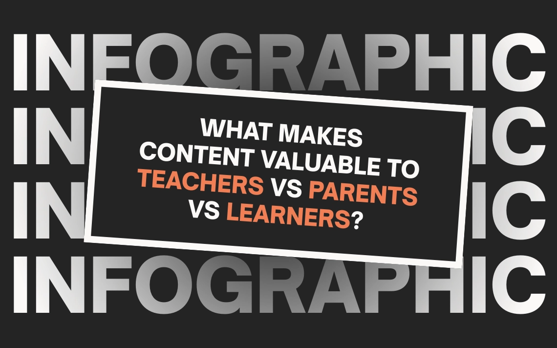
Now that you know how to use proportion in your work, it’s time to brush up on the other graphic design principles you have at your disposal. Luckily, we’ve got an overview of each one in our 12 Principles of Graphic Design infographic!