
In today’s ever-connected digital era, where our smartphones have become an extension of ourselves, creating social content with a mobile-first design approach is no longer an option: it’s a necessity.
Mobile devices have taken centre stage in our lives, and social media platforms have adapted to this trend. To stand out and capture your audience’s attention, it’s crucial to create thumb-stopping visual experiences.
In this guide, we’ll explore the concept of mobile-first design for social media, share expert techniques, and discuss best practices to help you make content that will stand out on mobile.
Why Mobile-First Design Matters
In a world where people are constantly on the move, mobile devices have become the primary means of accessing social media for the vast majority of users.
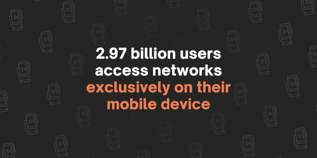
In fact, did you know that over 2.97 billion people exclusively use social media on their mobile devices? [source: Backlinkio] This shift in user behaviour underscores the importance of designing content with mobile screens in mind.
Optimizing for Small Screens
When we think about making social media content, we need to shift our mindset. In the past, we would have created large graphics with big desktop screens in mind as the primary viewing medium. However, as we’ve already seen, most social media users are accessing their networks of choice on mobile devices.
So when creating content, we now need to design our graphics and videos with mobile in mind. Something we always tell our clients here at Giraffe Social is that mobile content can scale up to fit any screen size or dimension with ease, but content made for desktops often doesn’t translate well to mobile.
BONUS: Want to take your social media game to the next level? Be sure to run through these checklists on a regular basis!
Picking the Right Dimensions
The first thing you should consider when making content on social media is what platform you’ll be posting to. Each social platform will have its own quirks, required dimensions, and best practices.
So whilst you can make one image and repost it on every platform, the best practice is to resize and realign images and text within your content to best suit the platform you’re posting to.
As we said, each platform will have its own requirements. That’s why we highly recommend you bookmark this page from Sprout Social: Always up-to-date guide to social media image sizes.
Controlling the Screen
As you’ll already know, when scrolling through social media, you can only see one post at a time. You scroll, see a post, and scroll away from it if it doesn’t grab your attention.
The actual time on this varies, but most reports suggest that you have about three seconds to catch someone’s attention on social media. And if you find yourself in the position of wanting to grow your brand on social, making the most of these three seconds is vital.
This is where optimising your content for mobile is very important.
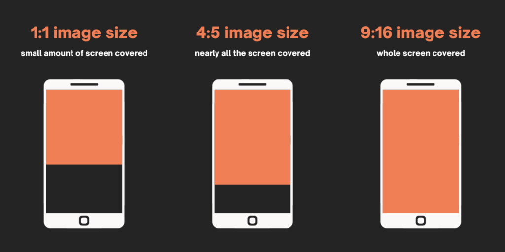
Take Instagram, for example. Most accounts will post in the 1:1 (square) format. This is usually fine, but it doesn’t take up much real estate on a mobile device. There’s actually a second size you can play with!
The 4:5 (rectangle) format is 25% taller than its square counterpart. Not that important, right? Well, wrong! This tiny increase in height allows content to take up more space on the screen when a user is scrolling through their feed. This, in turn, gives you more opportunities to grab their attention and – hopefully – stop them from scrolling past your content.
Videos = Portrait
It’s no secret that platforms like TikTok and Instagram Reels have dramatically shifted the way we view video content on social media. Not only have they gotten shorter (the average length of a TikTok video is just 10 – 15 seconds!) but they’ve also seen a dramatic change in sizing.
Platforms like TikTok are designed to be used in portrait mode – meaning that your phone is the “right way up”, and not at a horizontal angle. This core functionality of the app means that video content now has to be in a portrait format, so it can fill the entire screen.
So when making video content for social media – especially platforms like Instagram Reels, Stories, and TikTok – be sure to format it using portrait dimensions (1080px x 1920px) as this will ensure your content is covering the whole screen!
Conclusion
The way we all use social media has seen huge changes over the years. With more and more of us using our mobile phones as the primary way in which we access social media platforms, there’s never been a greater need to rethink the way you approach content creation.
So when making content for social, remember that you should be optimising for mobile, which means using the correct dimensions, controlling the screen as much as possible, and prioritising portrait video.
When you make a considered effort to optimise your content for mobile, you give yourself the best chance of catching the attention of your target audience! Optimising for mobile is just one small part of a wider content strategy. And if you want to know how to make a killer content strategy for your brand, our in-depth guide has everything you need to know!