

Are you looking to learn how to use emphasis in design to create better content? If so, you’re in the right place!
When it comes to creating content for social media, you need to know how to put together exciting and visually interesting graphics that will make your audience want to keep coming back.
When we think about emphasis, we should be thinking in terms of highlighting, specifically highlighting the most important elements within a design that you want your readers to pay attention to.
In this guide, you’ll learn exactly what emphasis in design is, how it works, and how you can use it to level up your social content.
What Does Emphasis in Design Mean?
In graphic design, emphasis refers to the technique of creating a focal point in your composition. This can be achieved through various means, like using a particular shape, object, or text that you consider to be the most important part of the design.
Once created, the viewer’s eye will be naturally drawn to it, allowing your message to be communicated effectively.
To create emphasis, there are several design techniques that can be employed. These include the use of colour, size, contrast, spacing, and more. By making use of these techniques, you’ll be able to guide the viewer’s eye to the most important part of the design, as well as ensure it stands out from the rest of the elements in the composition.
Keep reading to learn how to create emphasis in your content!
How to Create Emphasis in Design
Contrast
By using contrasting elements, such as light and dark colours, large and small text, or different typography styles, you can create a visual hierarchy and guide the viewer’s attention to the most important part of your design.
Check out our complete guide to using contrast in design here.
Colour
Using colour can be an effective way to create emphasis, as bright, bold hues naturally draw the eye. You can use colour to highlight important elements, or create contrast by using a bold colour against a neutral background.
Mixing warm and cool colours is a great way of making one element stand out from the crowd, whilst also maintaining visual cohesion.
Before throwing a tonne of different colours into your design to create emphasis, you should take a few minutes to discover the psychological signals that colours give off to your audience.
Size
By increasing the size of an element, you can make it stand out and create a focal point. This is especially effective for text or images that you want to emphasize.
A good way of doing this is by playing with sizing and balance to create a primary focal point.
Negative Space (White Space)

Negative space, or white space, can be used to create emphasis by framing an element and drawing attention to it. This can also give your design a clean, minimalist look.
When making use of white space, it’s important to remember that too much empty space in a design can leave your composition looking dull and, well, empty. Use white space sparingly and with purpose.
The example above is a great example of how negative space has been used on both sides of the composition to create a central focal point, drawing the viewer’s eye to the characters.
Typography
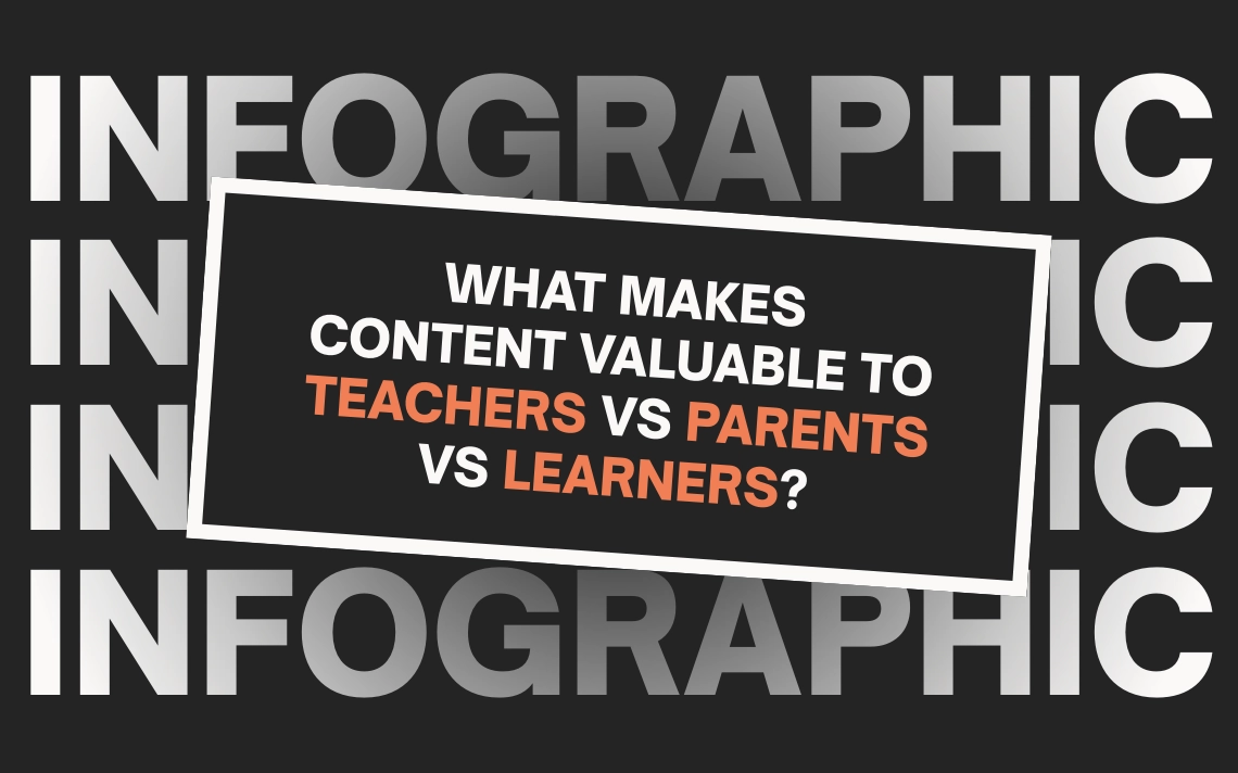
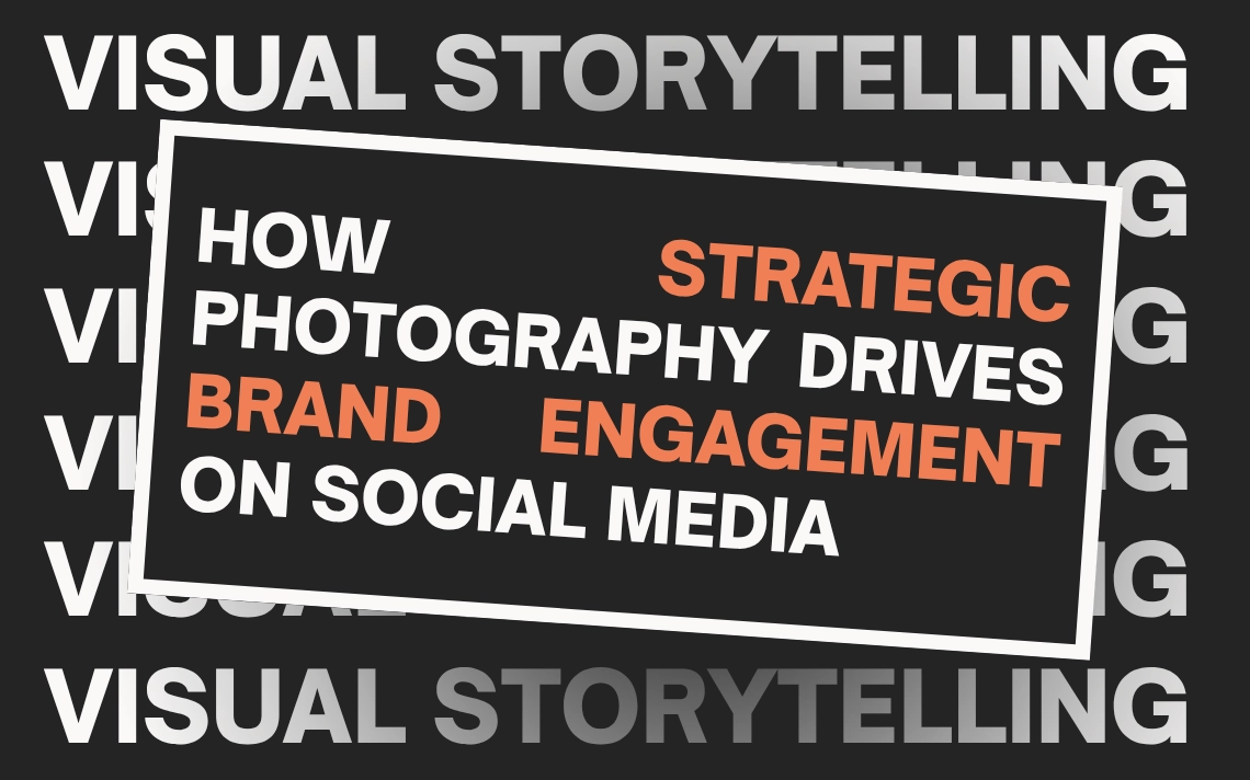
The use of different font styles, weights, and sizes can help create emphasis and visual hierarchy in your design. Bold or italicized text, for example, can draw the eye and add emphasis to important information.
There are a number of different font pairings that you can work with to create emphasis in your work. We recommend hunting through Google Fonts to find a combination that works for you.
/
Now that you know how to use emphasis in your work, it’s time to brush up on the other graphic design principles you have at your disposal. Luckily, we’ve got an overview of each one in our 12 Principles of Graphic Design infographic!