
When it comes to creating good content, you need to have an understanding of hierarchy in design. Simply put, hierarchy is the organised order of importance of elements within a composition.
On social media, you typically have about six seconds to grab someone’s attention and hook them in. If you don’t do that, they’ll keep on scrolling past the content you’ve worked so hard on. Because of this, you need to communicate the most important messages of your content as fast as possible.
This, as you’ve probably already guessed, can be done with a masterful use of hierarchy in design!
What Does Hierarchy in Design Mean?
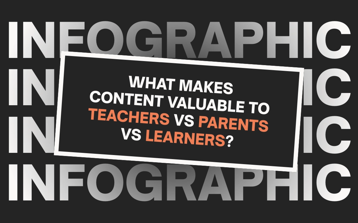
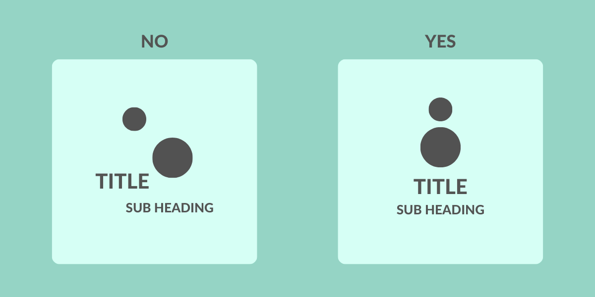
Take a look at the above image, we’re willing to bet you read each of the elements in the exact order we predicted. Are we mind readers? Nope, we just know how to make use of typographical hierarchy!
Almost everyone on earth, when presented with a test like that, will read each of the elements in the exact same order, and that’s for good reason.
Hierarchy in design refers to the sizing of elements within a composition, relative to their overall importance. In the above example, the title is the largest and most important element, which is why it takes up most of the space, and as such, your eyes automatically gravitated to that first.
The importance of having a clear hierarchy in your content cannot be understated. It allows you to…
- Create a clear visual flow for each element
- Emphasize the importance of different parts of your content over others
- Make your designs easier to understand
How to use Hierarchy in Design
Now that we know what hierarchy in design is, and why it’s important, it’s time to look at three simple ways you can create hierarchy within your own social media content.
Below you’ll find three easy-to-implement techniques that you can immediately start working with when creating content!
Size & Scale
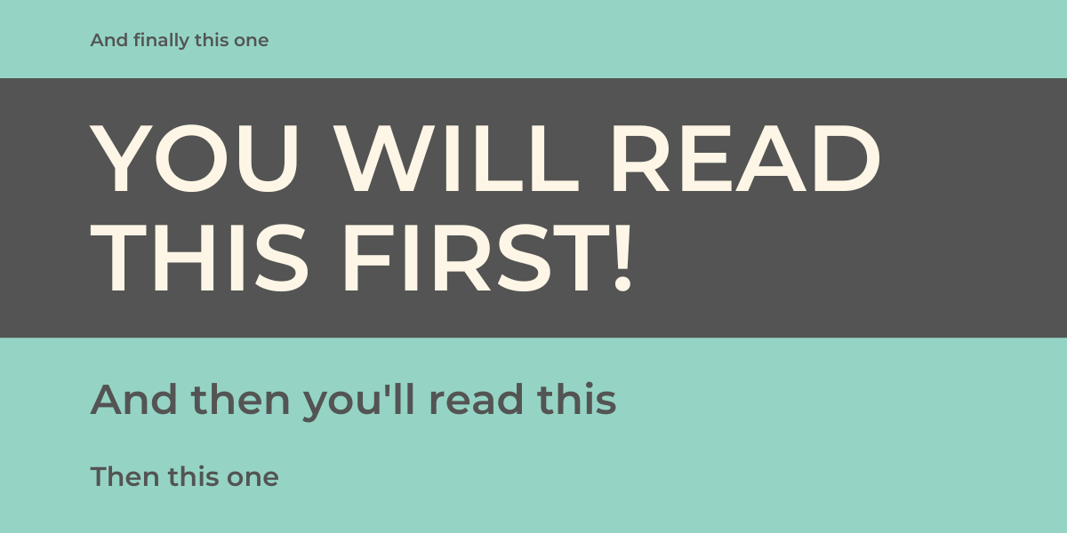
Element sizing is one of the easiest and most striking ways of creating a visual hierarchy within your content (see the “you’ll read this, then this” example).
As a fundamental aspect of graphic design, sizing plays a critical role in shaping the overall impact and meaning of your content.
When creating content, be sure to make the most important elements the largest, then size the rest of the elements relative to them. For example, your titles should always be the largest element, with subsequent information scaled appropriately.
Colour & Contrast
Working in marketing, you already know that colours play a huge role in how we view and perceive a brand. But did you also know that by making use of colour and contrast, you can also establish hierarchy within your content?
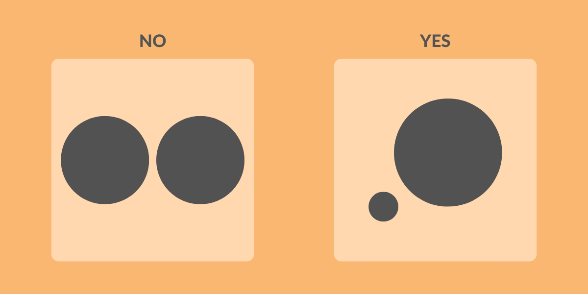
Darker colours are perceived as having more “visual weight”, which is just a funky design term that means we see darker elements as being more important, whilst lighter ones are assigned less importance.
If you’re limited with the sizes you can play with, adjusting colour tones and contrast (whilst also respecting your branding) can be an excellent way of establishing hierarchy.
Alignment
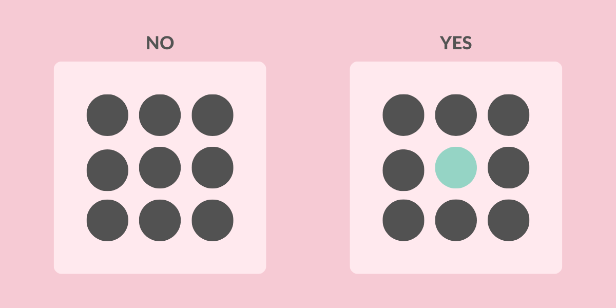
Unless you’re looking to break all the rules (see discordant balance here), every design should have some form of uniform symmetry.
In terms of social media content, the balance is usually a central line running through the canvas, with each of the individual elements aligned to it.
When your elements aren’t aligned with each other (and the canvas as a whole), it can lead to readers not understanding the visual hierarchy of your content, leaving them confused and unlikely to continue reading.
/
Now that you know how to use hierarchy in your work, it’s time to brush up on the other graphic design principles you have at your disposal. Luckily, we’ve got an overview of each one in our 12 Principles of Graphic Design infographic!