
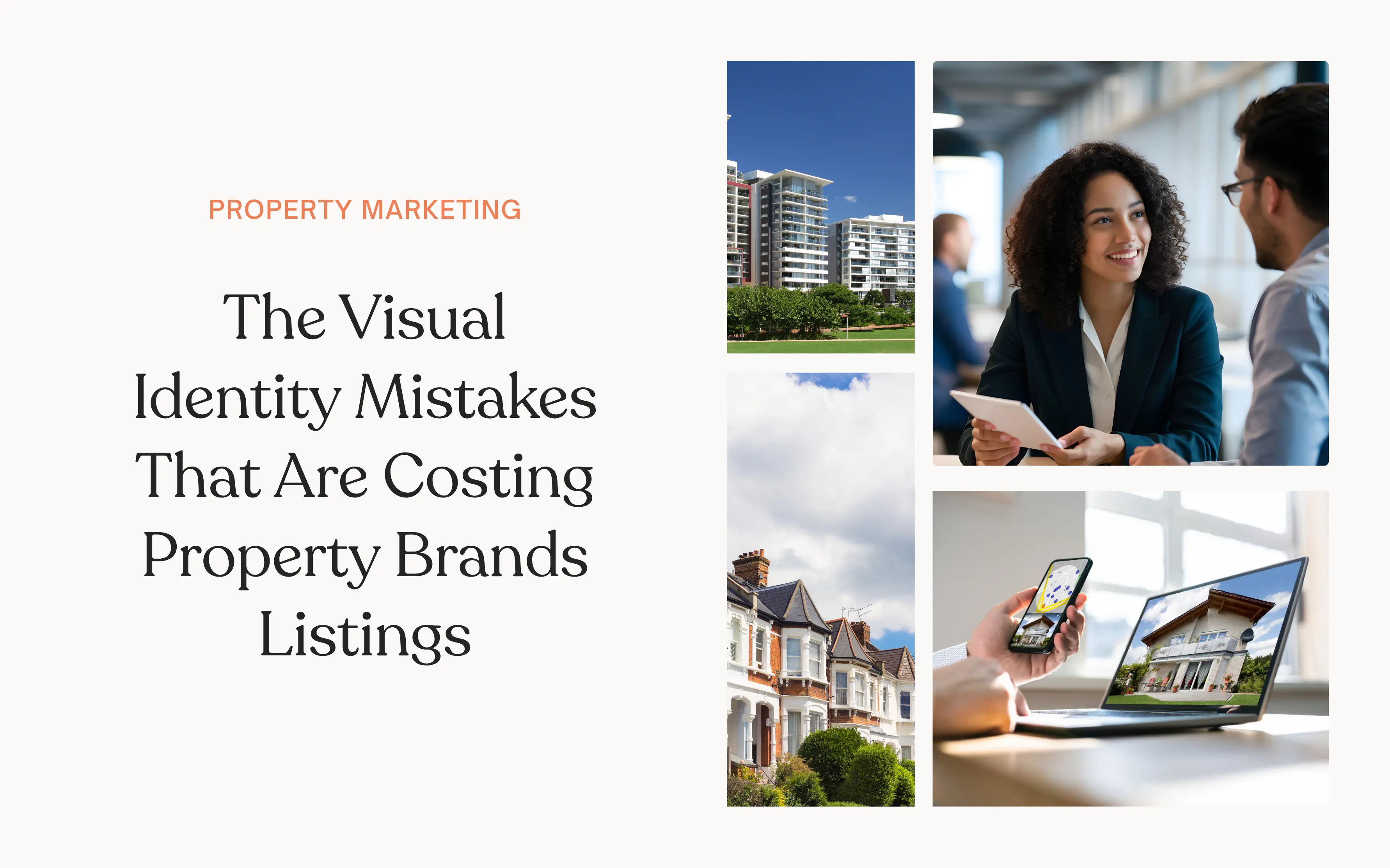
A brand’s visual identity is the first impression a potential vendor gets of a property brand. It’s how they first judge the competency of a business.
The reason property brands lose listings isn’t usually because of poor service; it’s because their visual identity doesn’t match up. When looking at a brand’s website, 75% of consumers admit that they judge a business’s credibility based on its website design.
First impressions can only be made once, and a lack of attention or consideration of visual identity instantly erodes trust. Consequently, this makes securing listings more of a battle, as trust has to be earned back in other ways.
The property brands that stand out are the ones that treat visual identity as core to their property marketing, not an afterthought, with a consistent identity across every touchpoint a client may encounter.
Why Visual Identity Has Control
Choosing an estate agent is one of the most high-stakes decisions a homeowner makes. Potential vendors benchmark you against competitors to determine who will sell their home quickest and for the most profit. They can’t audit your processes, benchmark your negotiation skills, or verify your track record in any meaningful way. So, they use what they can see to judge what they can’t.
Visual identity implies quality. Poor branding suggests poor quality of service. Published research suggests that people can form a visual opinion of a website in as little as 50 milliseconds. Once this opinion is formed, a negative first impression is very hard to reverse.
Vendors need to believe that you will deliver the same effort when marketing their property that you do when promoting your own business. If the foundations of your identity are inconsistent, low-quality or confusing, the perceived level of service is also poor.
4 Visual Identity Mistakes Costing Agents Listings
There are a few pretty common mistakes that repeatedly crop up in how property brands are visually presenting themselves. These mistakes often misrepresent the actual competency and knowledge of an agency, consequently causing them to lose out on listings.
Inconsistent Branding Across Platforms
Inconsistent branding is a trap many property brands fall into. Perhaps you’ve redesigned your website, with new logos, colours, fonts and style of imagery to create a better first impression. However, if you don’t carry this visual identity across every client touchpoint, such as social media, email campaigns and physical signage, you’re creating more problems than you solve.
Inconsistencies in visual identity make it harder to create brand awareness and recognition. The platforms are working separately as different businesses, rather than being part of the same ecosystem that supports one another.
It also signals disorganisation and confusion. If you’re unable to maintain consistency across your own channels, vendors will be questioning what it is you’re offering and what you represent. When confusion or doubt starts to creep into a decision-making process, closing that deal becomes increasingly unlikely. Especially when you’re competing with brands that maintain consistency and clarity in what they’re doing.
Weak or Generic Brand Positioning
We’ve all seen the property brands we’re talking about here. The generic navy blue or burgundy colour palette, the house icon as a logo, and the tagline messaging centred around being “local experts”. There are so many brands that communicate this visual identity that it becomes difficult to differentiate between them and pinpoint their USPs.
If your branding is too similar to all the other property brands in your area, clients start to focus on other factors when deciding who to instruct. This often comes down to pricing. It will likely lead to you reducing your commission as you try to compete with others on price, making your business less profitable.
Further reading: Long-term Content Strategy for New Build Property Brands
Poor-Quality or Mismatched Imagery
Photography is arguably the most visible part of a listing. It can be the difference in whether a property sells or not. Inconsistency in imagery across listings doesn’t just reflect badly on the property, but also on your agency.
A Redfin study analysing hundreds of thousands of property listings found that homes marketed with professional photography sell 32% faster than those without – spending an average of 89 days on market compared to 123 days for listings with standard images.
Vendors place a lot of value when choosing an agency on its ability to photograph their property. If your photography is poor-quality, messy or inconsistent, potential vendors will likely instruct other brands with a clear visual style, where they can be sure that their property will be represented in a way that makes it as attractive as possible.
Template-Heavy, Low-Effort Social Presence
Too many property brands are overly reliant on Canva templates for their social media content. Templates make it challenging for you to stand out from all the other agencies using the same ones. Simply changing it to incorporate your brand colours and sticking your logo on it is not enough. Overuse of these templates also signals low effort. This is usually the point where working with a social media content agency pays for itself, because bespoke design is the fastest way to stop looking like every other agency in the area. Vendors expect a certain level of creativity and proactivity when instructing an agent. These capabilities are not well represented if you are just using someone else’s template for your own marketing.

What Strong Visual Identity Actually Does
Your visual identity is your first impression. If you get this right, vendors are turning up to valuation meetings already confident in your capabilities, and converting these meetings into instructions becomes easier. That also means you’re less likely to need to negotiate fee reductions because the vendor isn’t trying to offset uncertainty about your quality with a discount.
Premium presentation of homes also helps create a higher perceived value. A premium, consistent brand sets an expectation before a buyer has even seen the property in person. That expectation influences how seriously they engage, how quickly they move, and ultimately what they offer. Better presented homes attract more motivated buyers and generate stronger offers.
Your current listings are a big lead generator for your next vendors, too. They want to see how you represent other homes to indicate how you will market theirs. Often, this all happens before any formal contact is made. So, ensuring every listing is consistent and high quality will ultimately lead to more properties being instructed. Not only that, but vendors who feel their property was marketed beautifully talk about it. It all comes back to a strong visual identity that feeds directly into referrals, which cost you nothing.
Further reading: Facebook Ads for Property Developers
What “Good” Actually Looks Like
Most vendors can’t tell the difference between a good agent and a great one until after the sale. What they can tell immediately is the difference between an agency that pays attention to the details versus one that doesn’t. PSP Homes is an example of what happens when an agency decides to take ownership over their visual identity and showcase this attention to detail.
PSP Homes is an estate agency based in Sussex, established in 1992. Although now a successful, award-winning property brand, this hasn’t always been the case. It was a rebrand in recent years that took them from a generic, basic agency to one that now attracts high-end homes and clients. Here’s what happened.
The Name Change
When PSP Homes was first established, it operated under the name Property Sales Partnership. Although it stated what they did as a business (sales in the property industry), it was actually working against them. The name of the company, the URL and the shopfront were inconsistent. Inconsistencies between how they referred to themselves had a detrimental effect on their brand recognition and recall with clients. It was also affecting their SEO, as people were searching for different things due to the name being unclear.
So, when Josh Wickwar took over as Managing Director, he decided it was time for a name change. They went from Property Sales Partnership to PSP Homes. They aligned this across all platforms, including website, social media, signage and shopfront, to ensure continuity of brand identity. The choice to drop the “sales” wording was also a deliberate one, following the idea that most people don’t like being “sold” to, and the word sales can often carry negative sentiment.
A New Visual Identity
After settling on a new name, the agency developed a new visual identity. Previously, they relied very heavily on templated design and imagery that looked overcomplicated and unimaginative. Their identity and values were lost in the sheer volume of information on their website.
The estate agency worked with branding experts, Cross Origin, to develop a new visual identity that felt clean and sophisticated, appealing to the kind of vendors and buyers they wanted to target.
They ditched the Microsoft Windows-esque logo and opted for a simplified yet striking logo, with bold yet elegant typography, and a colour palette that made them feel premium. Their website was rebuilt from a mobile-first perspective to reflect the browsing habits of their clientele. A photography style was established that supported the strengthened digital presence of the company, ensuring this was reflected from the website, to social media channels, and in the offices themselves.
The Outcome
The outcome of this rebrand is a testament to the fact that if brands present themselves in a thoughtful, consistent, and clear way, business can boom. PSP Homes didn’t change their processes or business model; all they did was align their visual identity to the quality of the work they were already delivering for years.
Since the rebrand, PSP Homes has become a standout agency in their area. They won gold at the British Property Awards for Haywards Heath in 2022, 2023, and 2024, opened new offices and expanded into the lettings sector. Their South Downs office achieved an average of 100% of the guide price in 2025, and the average sale is agreed in 30 days, which is half the area average.
These results are a consequence of how the brand is now being perceived. They are seen as trustworthy, premium, and effective at what they do.
Exquisite Homes

In addition to the awards and fantastic listing results, the rebrand PSP Homes undertook has allowed them to add another arm to their business – Exquisite Homes.
This section of the business focuses on the most premium listings in the area. “When coming to market you get one chance to make a first impression, so we like to make it count. That is why we created PSP Homes – Exquisite. To ensure that special homes receive the very best marketing.”
Exquisite Homes are priced upwards of £900,000. The package includes the highest-grade professional lifestyle photography, including drone and twilight shots, 4K professional video, bespoke home branding, a 20-page magazine-style brochure, social media teaser videos, creative copywriting, and home staging guidance.
This new arm of PSP Homes has become possible because of how the brand has positioned itself with its visual identity. They have proved with their own marketing and identity that they have an eye for detail and portray themselves as a luxury brand across all touchpoints. Vendor trust is instantly built, indicating that the same level of care and sophistication will be applied to their homes if instructed.
This new sub-brand would not have been possible if PSP Homes had not established a visual identity that better represented their quality and what they stand for.
Quick Self-Audit
It can be hard to tell what kind of shape your property brand is in from the inside. When you’ve looked at your own logo, website and social content every day for years, you stop seeing it the way a stranger does.
So before you look at the checklist below, take yourself outside of the business and really ask yourself how the vendor sees your brand. Here’s what you should be asking yourself:
Do You Have a Consistent, Recognisable Identity?
- Is your logo the same across your website, social profiles, boards and print materials?
- Are your brand colours and fonts consistent everywhere?
- If you were to ask a new member of staff to create content that is on-brand without guidance, could they?
- Has your branding been reviewed or updated in the last three years?
Further reading: Brand Consistency on Instagram: Why It Matters and How to Get It Right
Are You Demonstrating Quality in Everything You Create?
- Is every property photo professionally shot and consistently styled?
- Do floor plans, brochures and listings all share the same visual language?
- Does your marketing feel on par with (or better than) your biggest competitors?
Does Your Marketing Feel Premium?
- Is your social media content more than just reposting Rightmove listings?
- Are your templates designed rather than “borrowed” from Canva?
- Does your written content reflect the same standard as your visuals?
Is Your Brand Someone Vendors Can Trust?
- Would a vendor searching your name online feel reassured by what they find?
- Is your brand consistent, no matter where someone discovers you?
- Is there anything in your public-facing presence that would make a vendor hesitate before calling you?
If you can confidently answer these questions positively, then it’s likely that you have a good, well-established visual identity for your property brand. If you paused, skipped, or found yourself making excuses for any of these questions, that is what is costing you listings. Every time a vendor researches you and doesn’t like what they see, they move on to someone else.
The good news is that visual identity is fixable. Unlike with things like market conditions, location and competition, your visual identity is something that is completely in your control. Get it right, and you will see significant impacts on your listings and the way your business is perceived.
Conclusion
Visual identity is something that you should be investing in from day one. It’s not the case of having a pretty logo and some nice fonts. Presenting your property brand in a considered and consistent way across all visual touchpoints is going to have a significant impact on the success of your business.
Most of your competitors are making at least one of these mistakes right now. If your brand clearly communicates quality and care before you’ve said a word, you’re already ahead.
Want to make the most of social media for your property brand? Get in touch to see how we can level up your social strategy today!